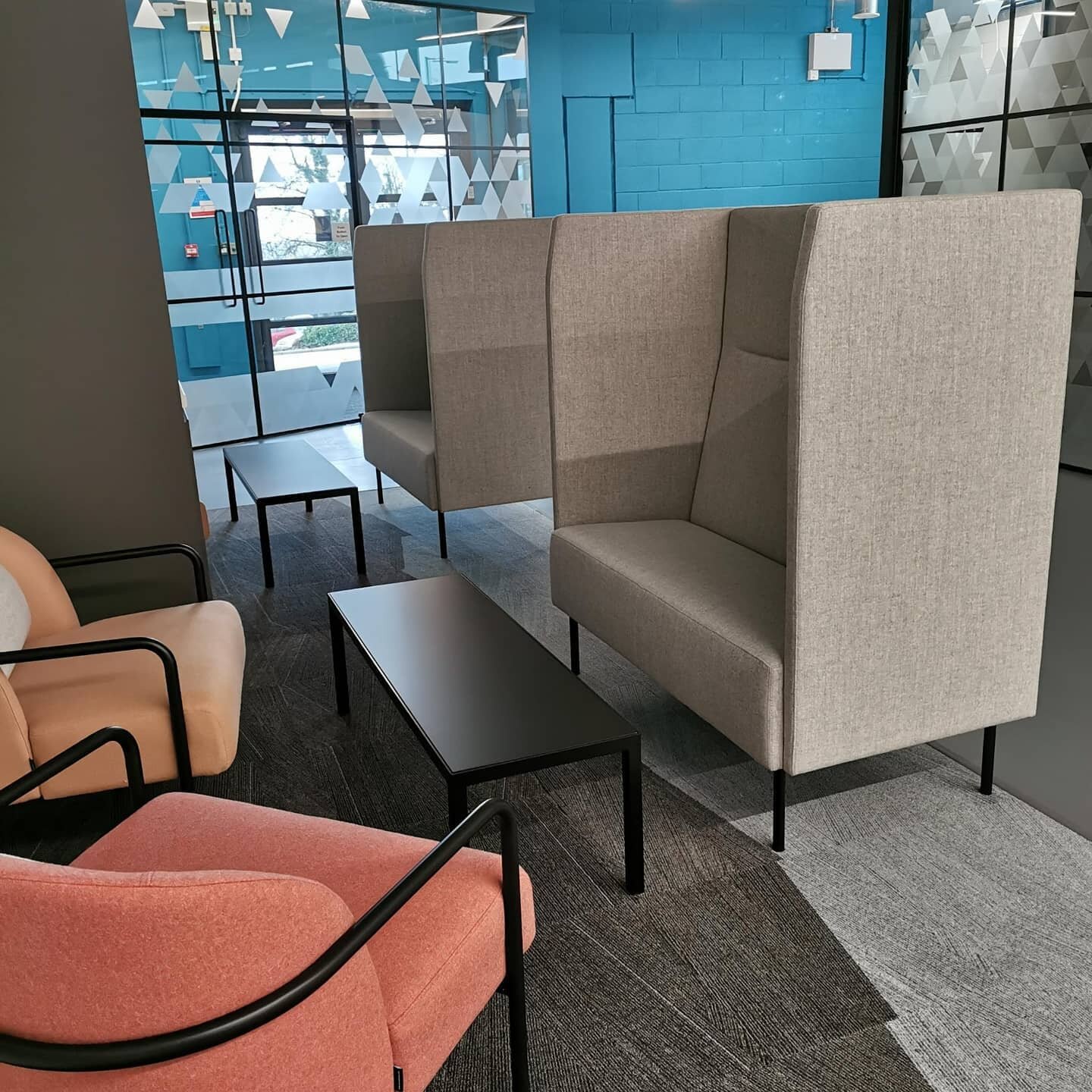
Wayfinding signage at Krowji creative space
Quay studio was delighted to be involved in a major wayfinding re brand at Krowji. The building once was a former grammar school and now is the largest creative hub in Cornwall. Providing studios, workspaces, meeting rooms and cafe for a large range of creative business. The client came to us with a problem that the site needed better signage to clearly distinguish each building and direct residents and guests around the large site. The new signage was also required to incorporate the new phase 2 development of the Percy Williams Building.
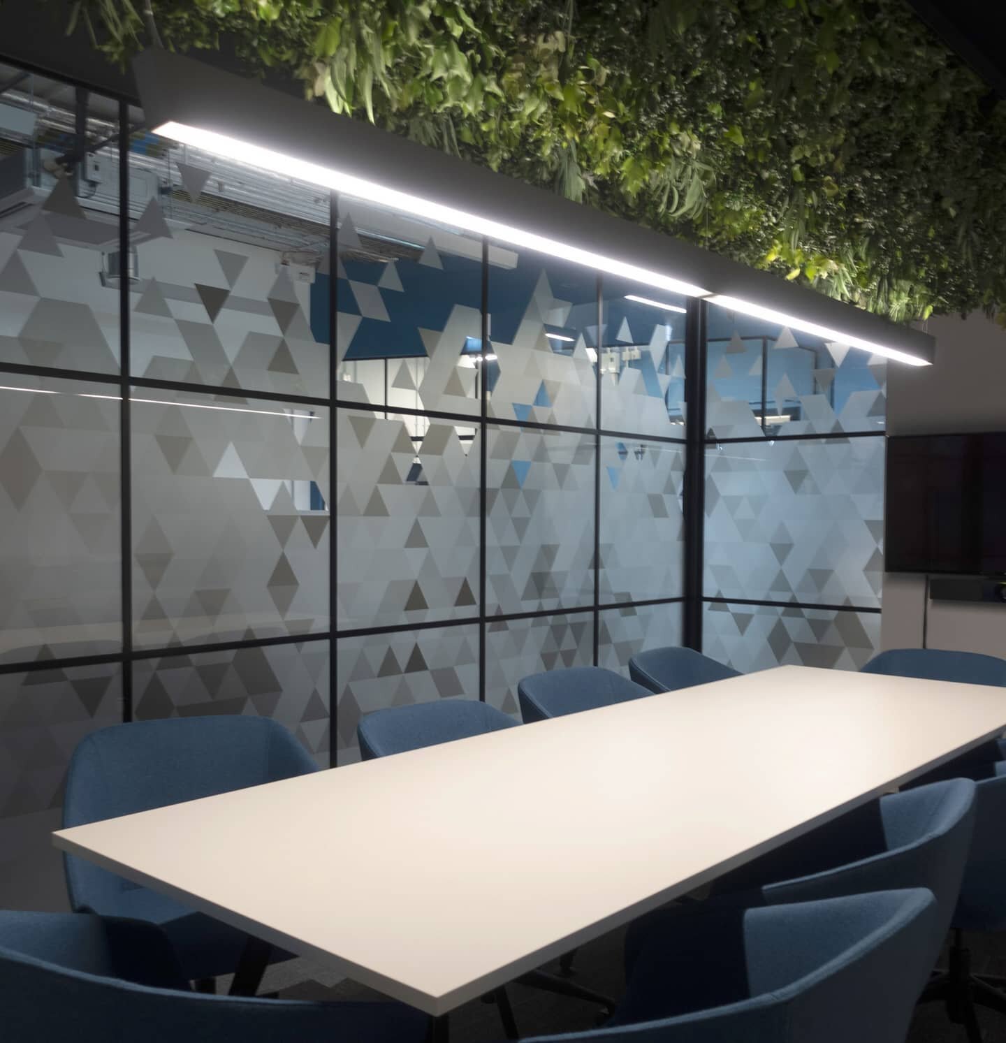
We set out developing a solution to find a better signage system. We understood the site was made up of 6 separate buildings, all of which very different in construction and materials. We designed a wayfinding system, using colours and textures found in and around Cornwall or on the site itself to help to identify each building. We then found textures to represent each building and set about creating a graphic language.
From having numerous site visits and working closely with the client we identified the best locations for each signs to help establish a clear way finding route for all visitor, achieving a clear line of vision from all entry points. We designed the signage to wrap around the buildings to draw the eye, catching hints of colour to make it easier to identify a clear route.
The meanings behind the signs are as follows:
*Percy Williams - Texture comes from the geometric grid seen in the staircase grills - the Percy Williams Building is a relatively new building which was part of phase 1 works.
*1907 Building - Is the oldest building on site and marks the year the Old grammar school opened. the pattern reflects its history of being the main entrance of the former school with a tell tail outline of the original terrazzo floor, it is not the foyer and cafe entrance.
*The Old Schoolhouse retains the wonderful original parquet floor, as its such a striking feature of the space we had to pay homage to this lovely texture and used this pattern within the signage.
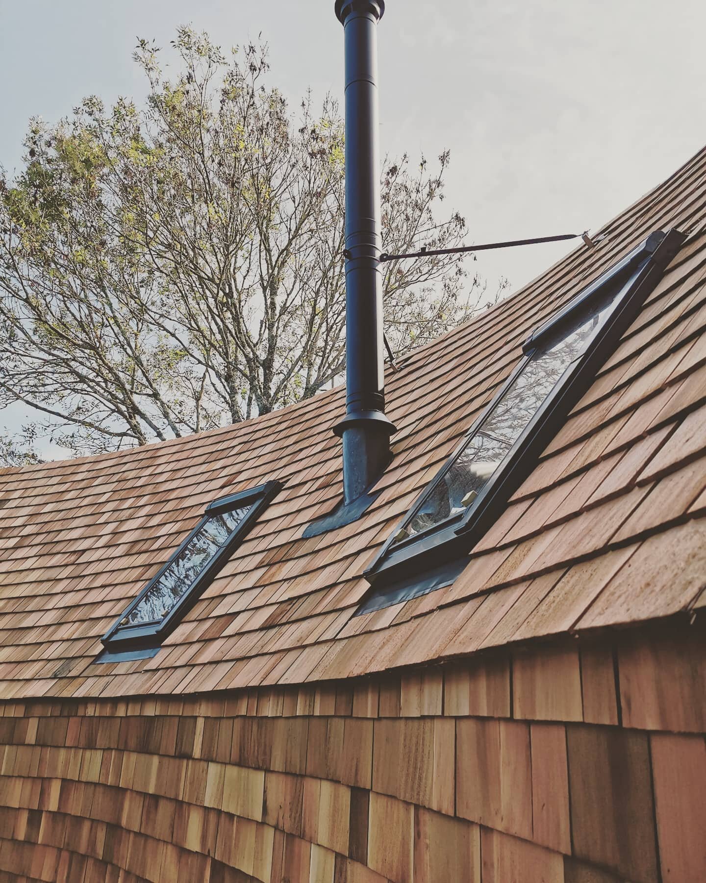
*The Elliot hut pattern was the recognisable wood grain which makes up the timber construction of the building.
*The North Light block signage pattern design draws its inspiration from the undulating metal cladding that runs along sections of the building. With glass covering much of the single storey building, the pattern depicts the textures found from the ever present reflections.
*The Science Block which is no longer home to science classrooms but a creative hub of artists, has a signage pattern is inspired by the retro ceiling tile.
For wayfinding as part of a wider project please use our contact form we would love to hear from you.